Population Differences in the Distribution of First-degree Relatives
Manqing Lin, Tina Lasisi
2025-06-18 13:50:19
Last updated: 2025-06-18
Checks: 6 1
Knit directory: PODFRIDGE/
This reproducible R Markdown analysis was created with workflowr (version 1.7.1). The Checks tab describes the reproducibility checks that were applied when the results were created. The Past versions tab lists the development history.
The R Markdown file has unstaged changes. To know which version of
the R Markdown file created these results, you’ll want to first commit
it to the Git repo. If you’re still working on the analysis, you can
ignore this warning. When you’re finished, you can run
wflow_publish to commit the R Markdown file and build the
HTML.
Great job! The global environment was empty. Objects defined in the global environment can affect the analysis in your R Markdown file in unknown ways. For reproduciblity it’s best to always run the code in an empty environment.
The command set.seed(20230302) was run prior to running
the code in the R Markdown file. Setting a seed ensures that any results
that rely on randomness, e.g. subsampling or permutations, are
reproducible.
Great job! Recording the operating system, R version, and package versions is critical for reproducibility.
Nice! There were no cached chunks for this analysis, so you can be confident that you successfully produced the results during this run.
Great job! Using relative paths to the files within your workflowr project makes it easier to run your code on other machines.
Great! You are using Git for version control. Tracking code development and connecting the code version to the results is critical for reproducibility.
The results in this page were generated with repository version d36349f. See the Past versions tab to see a history of the changes made to the R Markdown and HTML files.
Note that you need to be careful to ensure that all relevant files for
the analysis have been committed to Git prior to generating the results
(you can use wflow_publish or
wflow_git_commit). workflowr only checks the R Markdown
file, but you know if there are other scripts or data files that it
depends on. Below is the status of the Git repository when the results
were generated:
Ignored files:
    Ignored:    .DS_Store
    Ignored:    .Rhistory
    Ignored:    .Rproj.user/
    Ignored:    data/.DS_Store
    Ignored:    data/sims/.DS_Store
    Ignored:    output/.DS_Store
    Ignored:    output/simulation_20240726-155743/.DS_Store
    Ignored:    output/simulation_20240726-162034_11228488/.DS_Store
    Ignored:    output/simulation_20240726-163235_11228791/.DS_Store

Unstaged changes:
    Modified:   analysis/relative-distribution.Rmd
Note that any generated files, e.g. HTML, png, CSS, etc., are not included in this status report because it is ok for generated content to have uncommitted changes.
These are the previous versions of the repository in which changes were
made to the R Markdown (analysis/relative-distribution.Rmd)
and HTML (docs/relative-distribution.html) files. If you’ve
configured a remote Git repository (see ?wflow_git_remote),
click on the hyperlinks in the table below to view the files as they
were in that past version.
| File | Version | Author | Date | Message |
|---|---|---|---|---|
| Rmd | c69b10f | linmatch | 2025-03-17 | update sibling frequency calculation |
| html | c69b10f | linmatch | 2025-03-17 | update sibling frequency calculation |
| Rmd | b373384 | linmatch | 2025-02-14 | update |
| html | b373384 | linmatch | 2025-02-14 | update |
| html | 020be6f | linmatch | 2025-01-31 | workflowr update |
| Rmd | 27739be | linmatch | 2025-01-31 | Update relative-distribution.Rmd |
| Rmd | d9eb4e2 | linmatch | 2025-01-31 | update fertility shift plot |
| Rmd | b856701 | linmatch | 2025-01-22 | update final report |
| html | b856701 | linmatch | 2025-01-22 | update final report |
| Rmd | 3416046 | linmatch | 2025-01-21 | update final report |
| Rmd | 4e0a07c | linmatch | 2025-01-20 | update report |
| html | 4e0a07c | linmatch | 2025-01-20 | update report |
| Rmd | 23ba6ad | linmatch | 2025-01-20 | update final report |
| Rmd | 415f30a | linmatch | 2025-01-14 | hide code chunk and unnecessary output |
| html | 415f30a | linmatch | 2025-01-14 | hide code chunk and unnecessary output |
| Rmd | 159a638 | linmatch | 2025-01-13 | Update relative-distribution.Rmd |
| Rmd | 5280afb | linmatch | 2025-01-13 | fix test mean family size |
| Rmd | 9778698 | linmatch | 2025-01-09 | update |
| html | 9778698 | linmatch | 2025-01-09 | update |
| Rmd | 0c90de8 | linmatch | 2024-12-18 | clean and organize the document |
| Rmd | f567c4a | linmatch | 2024-12-16 | update |
| html | f567c4a | linmatch | 2024-12-16 | update |
| Rmd | 231390a | linmatch | 2024-12-11 | update analysis |
| html | 231390a | linmatch | 2024-12-11 | update analysis |
| Rmd | 8007864 | linmatch | 2024-12-03 | update workflow page |
| html | 8007864 | linmatch | 2024-12-03 | update workflow page |
| Rmd | e553adc | linmatch | 2024-11-21 | Update relative-distribution.Rmd |
| Rmd | e76576b | linmatch | 2024-11-21 | Update relative-distribution.Rmd |
| Rmd | 21f0f4f | linmatch | 2024-11-19 | Update relative-distribution.Rmd |
| Rmd | f583798 | linmatch | 2024-11-14 | Update relative-distribution.Rmd |
| Rmd | 900b2e4 | linmatch | 2024-11-14 | Update relative-distribution.Rmd |
| Rmd | 776920f | linmatch | 2024-11-12 | update the model fit analysis in children’s part |
| html | 776920f | linmatch | 2024-11-12 | update the model fit analysis in children’s part |
| Rmd | 06a8f96 | linmatch | 2024-11-05 | update sibling’s part |
| html | 06a8f96 | linmatch | 2024-11-05 | update sibling’s part |
| Rmd | 1741cb1 | linmatch | 2024-11-05 | fix test |
| Rmd | 4e68621 | linmatch | 2024-11-05 | fix chisq-test in cohort stability |
| html | 4e68621 | linmatch | 2024-11-05 | fix chisq-test in cohort stability |
| Rmd | 6fb5b40 | linmatch | 2024-10-29 | update sibling’s distribution plot |
| Rmd | 570abb0 | linmatch | 2024-10-22 | update sibling part |
| Rmd | 2e09e08 | linmatch | 2024-10-22 | workflow build |
| html | 2e09e08 | linmatch | 2024-10-22 | workflow build |
| Rmd | bb2c61b | linmatch | 2024-10-21 | complete fertility shift analysis |
| Rmd | 842d935 | linmatch | 2024-10-17 | update fertility shift |
| Rmd | 2ae8460 | linmatch | 2024-10-16 | fix the chisq-test |
| Rmd | 9632ae1 | linmatch | 2024-10-12 | update cohort stability |
| Rmd | 9852339 | linmatch | 2024-10-08 | update cohort stability |
| html | 9852339 | linmatch | 2024-10-08 | update cohort stability |
| Rmd | 7ec169f | linmatch | 2024-10-03 | update sibling distribution |
| Rmd | 27b986f | linmatch | 2024-10-01 | update stability cohort analysis |
| Rmd | 57a97db | linmatch | 2024-09-30 | Update relative-distribution.Rmd |
| Rmd | 52aa7f8 | linmatch | 2024-09-27 | improving code on Part1 |
| Rmd | c54a746 | linmatch | 2024-09-26 | update and fix step 2 |
| Rmd | 94d00b3 | linmatch | 2024-09-24 | fix step1 |
| Rmd | 1225480 | linmatch | 2024-09-23 | update on step1 |
| Rmd | 83174c0 | Tina Lasisi | 2024-09-22 | Instructions and layout for relative distribution |
| html | 83174c0 | Tina Lasisi | 2024-09-22 | Instructions and layout for relative distribution |
| Rmd | 78c1621 | Tina Lasisi | 2024-09-21 | Update relative-distribution.Rmd |
| Rmd | f4c2830 | Tina Lasisi | 2024-09-21 | Update relative-distribution.Rmd |
| Rmd | 2851385 | Tina Lasisi | 2024-09-21 | rename old analysis |
| html | 2851385 | Tina Lasisi | 2024-09-21 | rename old analysis |
Introduction
The relative genetic surveillance of a population is influenced by the number of genetically detectable relatives individuals have. First-degree relatives (parents, siblings, and children) are especially relevant in forensic analyses using short tandem repeat (STR) loci, where close familial searches are commonly employed. To explore potential disparities in genetic detectability between African American and European American populations, we examined U.S. Census data from four census years (1960, 1970, 1980, and 1990) focusing on the number of children born to women over the age of 40.
Data Sources
We used publicly available data from the Integrated Public Use Microdata Series (IPUMS) for the U.S. Census years 1960, 1970, 1980, and 1990. The datasets include information on:
- AGE: Age of the respondent.
- RACE: Self-identified race of the respondent.
- chborn_num: Number of children ever born to the respondent.
Data citation: Steven Ruggles, Sarah Flood, Matthew Sobek, Daniel Backman, Annie Chen, Grace Cooper, Stephanie Richards, Renae Rogers, and Megan Schouweiler. IPUMS USA: Version 14.0 [dataset]. Minneapolis, MN: IPUMS, 2023. https://doi.org/10.18128/D010.V14.0
Data Preparation
Filtering Criteria: We selected women aged 40 and above to ensure that most had completed childbearing.
Due to the terms of agreement for using this data, we cannot share the full dataset but our repo contains the subset that was used to calculate the mean number of offspring and variance.
Race Classification: We categorized individuals into two groups:
- African American: Those who identified as “Black” or “African American”.
- European American: Those who identified as “White”.
Calculating Number of Siblings: For each child of these women, the number of siblings (n_sib) is one less than the number of children born to the mother:
\[ n_{sib} = chborn_{num} - 1 \]
path <- file.path(".", "data")
savepath <- file.path(".", "output")

prop_race_year <- file.path(path, "proportions_table_by_race_year.csv")
data_filter <- file.path(path, "data_filtered_recoded.csv")

children_data = read.csv(prop_race_year)
mother_data = read.csv(data_filter)
Distribution of Number of Children Across Census Years
First we visualize the general trends in the frequency of the number of children for African American and European American mothers across the Census years by age group.
# Calculate proportions within each group, ensuring proper normalization
df_proportions <- df %>%
  group_by(YEAR, RACE, AGE_RANGE, chborn_num) %>%
  summarise(count = n(), .groups = "drop") %>%
  group_by(YEAR, RACE, AGE_RANGE) %>%
  mutate(proportion = count / sum(count)) %>%
  ungroup()

# Reshape data for the mirror plot
df_mirror <- df_proportions %>%
  mutate(proportion = if_else(RACE == "White", -proportion, proportion))

# Create color palette
my_colors <- colorRampPalette(c("#FFB000", "#F77A2E", "#DE3A8A", "#7253FF", "#5E8BFF"))(13)

# Create the plot
child_plot <- ggplot(df_mirror, aes(x = chborn_num, y = proportion, fill = as.factor(chborn_num))) +
  geom_col(aes(alpha = RACE)) +
  geom_hline(yintercept = 0, color = "black", size = 0.5) +
  facet_grid(AGE_RANGE ~ YEAR, scales = "free_y") +
  coord_flip() +
  scale_y_continuous(
    labels = function(x) abs(x),
    limits = function(x) c(-max(abs(x)), max(abs(x)))
  ) +
  scale_x_continuous(breaks = 0:12, labels = c(0:11, "12+")) +
  scale_fill_manual(values = my_colors) +
  scale_alpha_manual(values = c("White" = 0.7, "Black/African American" = 1), guide = "none") +
  labs(
    title = "Distribution of Number of Children by Census Year, Race, and Age Range",
    x = "Number of Children",
    y = "Proportion",
    fill = "Number of Children",
    caption = "White population shown on left (negative values), Black/African American on right (positive values)\nProportions normalized within each age range, race, and census year\nFootnote: The category '12+' includes families with 12 or more children."
  ) +
  theme_minimal() +
  theme(
    plot.title = element_text(size = 14, hjust = 0.5),
    axis.text.y = element_text(size = 8),
    strip.text = element_text(size = 10),
    legend.position = "none",
    panel.grid.major.y = element_blank(),
    panel.grid.minor.y = element_blank()
  )

print(child_plot)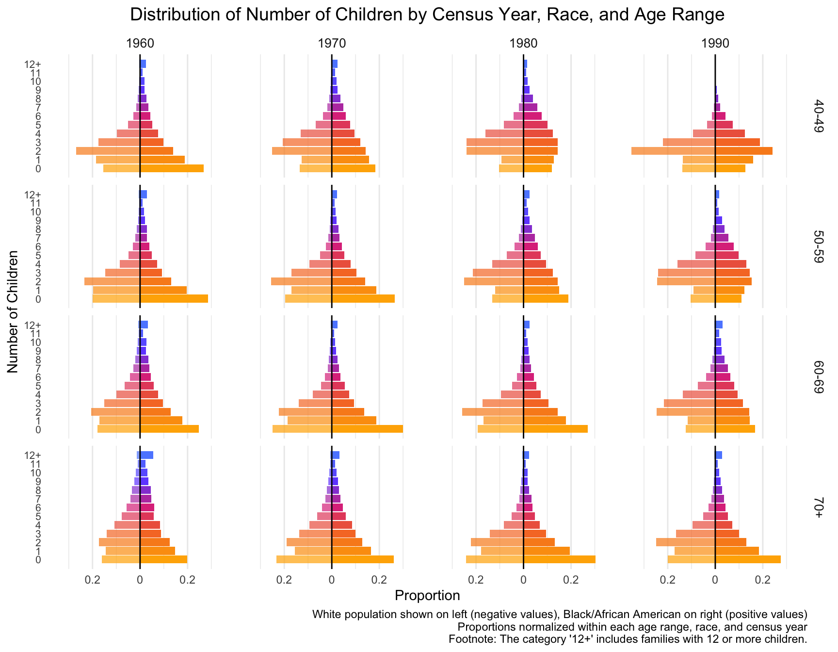
| Version | Author | Date |
|---|---|---|
| f567c4a | linmatch | 2024-12-16 |
With this visualization of the distribution of the data, we can see that there are differences between races, census year and age groups. NOTE:The category ‘12+’ includes families with 12 or more children.
- By Census Year: From 1960 to 1990, the proportion of mothers with larger families (6+ children) decreases for both races across all age groups. Smaller families (1-3 children) become more common over the decades.
- By Age Group: Older age groups (e.g., 70+) show a higher frequency of larger family sizes, especially in earlier Census years. Younger age groups (40-49) show a stronger shift toward smaller family sizes in more recent decades.
- By Race: African American mothers (right side) consistently show a higher proportion of larger families (6+ children) compared to European American mothers.
Model Fit Across Census Years
We will now find out the best model fitted for each combination of race, census year, and age range.
Fit and Compare Models
For each combination, we fit the following candidate models:
- Poisson Model
- Negative Binomial (NB) Model
- Zero-Inflated Poisson (ZIP) Model
- Zero-Inflated Negative Binomial (ZINB) Model
Record the Best Model for Each Subset
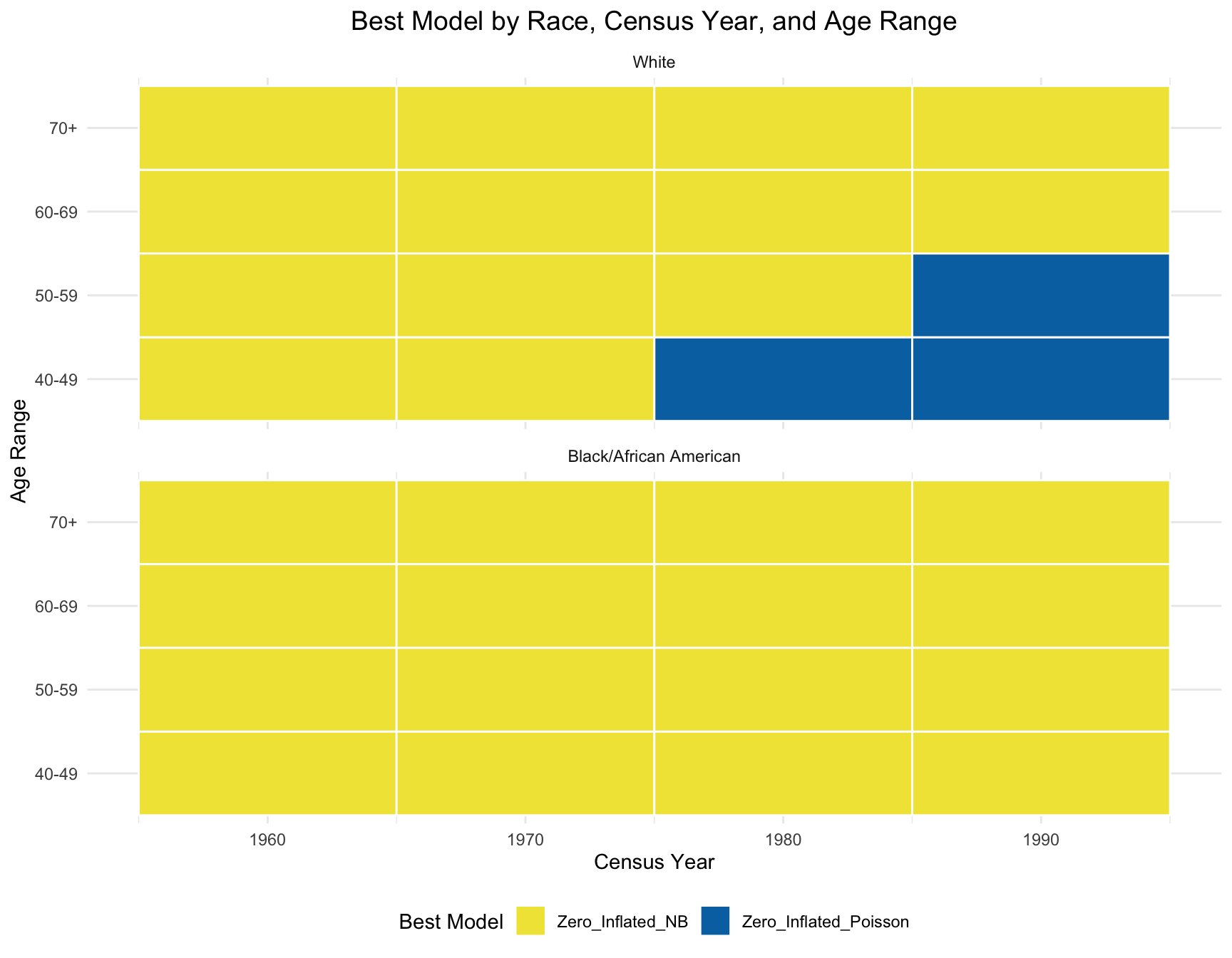
Then, we find the AIC value of four models for each combination and record the model with minimum AIC. The following is the table that summarize the best model for each combination of race, census year and age group.
# Add a Best_Model column to store the best model based on minimum AIC
best_models$Best_Model <- apply(best_models, 1, function(row) {
  # Get AIC values for Poisson, NB, ZIP, and ZINB models
  aic_values <- c(Poisson = as.numeric(row['AIC_poisson']),
                  Negative_Binomial = as.numeric(row['AIC_nb']),
                  Zero_Inflated_Poisson = as.numeric(row['AIC_zip']),
                  Zero_Inflated_NB= as.numeric(row['AIC_zinb']))

  # Find the name of the model with the minimum AIC value
  best_model <- names(which.min(aic_values))

  return(best_model)
})

best_models <- best_models %>% dplyr::select(Race, Census_Year, Age_Range, Best_Model)
# View the updated table with the Best_Model column
kable(best_models, caption="Summary Table of Best Model (Children)")| Race | Census_Year | Age_Range | Best_Model |
|---|---|---|---|
| White | 1960 | 40-49 | Zero_Inflated_NB |
| White | 1960 | 50-59 | Zero_Inflated_NB |
| White | 1960 | 60-69 | Zero_Inflated_NB |
| White | 1960 | 70+ | Zero_Inflated_NB |
| Black/African American | 1960 | 40-49 | Zero_Inflated_NB |
| Black/African American | 1960 | 50-59 | Zero_Inflated_NB |
| Black/African American | 1960 | 60-69 | Zero_Inflated_NB |
| Black/African American | 1960 | 70+ | Zero_Inflated_NB |
| White | 1970 | 40-49 | Zero_Inflated_NB |
| White | 1970 | 50-59 | Zero_Inflated_NB |
| White | 1970 | 60-69 | Zero_Inflated_NB |
| White | 1970 | 70+ | Zero_Inflated_NB |
| Black/African American | 1970 | 40-49 | Zero_Inflated_NB |
| Black/African American | 1970 | 50-59 | Zero_Inflated_NB |
| Black/African American | 1970 | 60-69 | Zero_Inflated_NB |
| Black/African American | 1970 | 70+ | Zero_Inflated_NB |
| White | 1980 | 40-49 | Zero_Inflated_Poisson |
| White | 1980 | 50-59 | Zero_Inflated_NB |
| White | 1980 | 60-69 | Zero_Inflated_NB |
| White | 1980 | 70+ | Zero_Inflated_NB |
| Black/African American | 1980 | 40-49 | Zero_Inflated_NB |
| Black/African American | 1980 | 50-59 | Zero_Inflated_NB |
| Black/African American | 1980 | 60-69 | Zero_Inflated_NB |
| Black/African American | 1980 | 70+ | Zero_Inflated_NB |
| White | 1990 | 40-49 | Zero_Inflated_Poisson |
| White | 1990 | 50-59 | Zero_Inflated_Poisson |
| White | 1990 | 60-69 | Zero_Inflated_NB |
| White | 1990 | 70+ | Zero_Inflated_NB |
| Black/African American | 1990 | 40-49 | Zero_Inflated_NB |
| Black/African American | 1990 | 50-59 | Zero_Inflated_NB |
| Black/African American | 1990 | 60-69 | Zero_Inflated_NB |
| Black/African American | 1990 | 70+ | Zero_Inflated_NB |
Analyze the Effect of Race, Census Year, and Age Range
After finding the best model, we want to check if races, age ranges, and census year has significant effect on the best-fitting model. By running a logistics regression, the result (The p-value for each variable is larger than 0.05) shows that there isn’t a significant association between the predictors(races, age ranges, and census year) and the best-fitting model.
# Recode Best_Model to a binary variable (e.g., "Zero_Inflated_NB" vs. "Other")
best_models$Best_Model_Binary <- ifelse(best_models$Best_Model == "Zero_Inflated_NB", 1, 0)

# Fit binary logistic regression
model_logistic <- glm(Best_Model_Binary ~ Race + Census_Year + Age_Range, family = binomial(), data = best_models)

# Summary of the logistic regression model
summary(model_logistic)
Call:
glm(formula = Best_Model_Binary ~ Race + Census_Year + Age_Range,
    family = binomial(), data = best_models)

Coefficients:
                             Estimate Std. Error z value Pr(>|z|)
(Intercept)                 8.741e+03  7.710e+06   0.001    0.999
RaceBlack/African American  8.903e+01  8.227e+04   0.001    0.999
Census_Year                -4.426e+00  3.902e+03  -0.001    0.999
Age_Range50-59              4.390e+01  5.002e+04   0.001    0.999
Age_Range60-69              8.990e+01  1.045e+05   0.001    0.999
Age_Range70+                8.990e+01  1.045e+05   0.001    0.999

(Dispersion parameter for binomial family taken to be 1)

    Null deviance: 1.9912e+01  on 31  degrees of freedom
Residual deviance: 2.4509e-09  on 26  degrees of freedom
AIC: 12

Number of Fisher Scoring iterations: 25
Visualize the Results
According to the resulting visualization, the ZINB model is the best fit for the black population across census year and age group. However, the ZINB model perform the best among the white population only across year 1960 and 1970, and age group 60-69 and 70+.
ggplot(best_models, aes(x = Census_Year, y = Age_Range, fill = Best_Model)) +
  geom_tile(color = "white", lwd = 0.5, linetype = 1) +
  facet_wrap(~Race, nrow = 2) +
  scale_fill_manual(values = c("Zero_Inflated_Poisson" = "#0072B2", "Zero_Inflated_NB" = "#F0E442")) +
  labs(
    title = "Best Model by Race, Census Year, and Age Range",
    x = "Census Year",
    y = "Age Range",
    fill = "Best Model"
  ) +
  theme_minimal() +
  theme(
    plot.title = element_text(size = 14, hjust = 0.5),
    legend.position = "bottom"
  )
Cohort Stability Analysis
From the previous analysis, we observe that there is discrepancy in the distribution between white and black American. Next, the goal is to determine if there is a significant change in any of the following across census years for the same cohort:
- Zero Inflation: Check if the proportion of women with zero children changes significantly over time for the same cohort.
- Family Size: Test if the mean and variance in the number of children changes for the same cohort over time.
- Model Fit: Analyze if the best-fitting model for the cohort changes over time.
Data Preparation
Firstly, we create a new variable cohort in the original data, which is calculated by subtracting the age range from census year.
### Table with Cohort
calculate_cohort <- function(census_year, age_range) {
  age_limits <- as.numeric(unlist(strsplit(age_range, "-|\\+")))

  if (length(age_limits) == 1) {
    lower_age <- age_limits
    upper_age <- Inf
  } else {
    lower_age <- age_limits[1]
    upper_age <- age_limits[2]
  }

  lower_cohort <- census_year - upper_age
  upper_cohort <- census_year - lower_age


  if (upper_age == Inf) {
    upper_cohort <- census_year - 70
  }

  return(paste(lower_cohort, upper_cohort, sep = "-"))
}

best_models <- best_models %>%
  mutate(Cohort = mapply(calculate_cohort, Census_Year, Age_Range)) %>%
  dplyr::select(Race, Census_Year, Age_Range, Best_Model, Cohort)
### Summary Statistics for Each Subset
df_merg <- df %>%
rename(Census_Year = YEAR, Race = RACE, Age_Range = AGE_RANGE)
# Perform a left join to merge the data frames
merged_data <- left_join(df_merg, best_models, by = c("Race", "Census_Year", "Age_Range"))Test for Significant Changes Over Time Within Each Cohort
a. Zero-Inflation Analysis
Here, we apply the chi-square test for each cohort within each race. Since some cohorts only have one corresponding census year, the test is not applicable for them.
## divided the corhort by race
merged_df_black <- merged_data %>% filter(Race == "Black/African American")
merged_df_white <- merged_data %>% filter(Race == "White")
# Function to determine the nature of change
determine_nature_of_change <- function(proportions) {
if (nrow(proportions) > 1) {
if (all(diff(proportions$Proportion_Zero_Children) > 0)) {
return("Increase")
} else if (all(diff(proportions$Proportion_Zero_Children) < 0)) {
return("Decrease")
} else {
return("Mixed/No Change")
}
} else {
return("Not Applicable")
}
}
# Add the Nature_of_Change column
results_black$Nature_of_Change <- NA # Initialize the column
# Loop through each cohort in results_black
for (i in 1:nrow(results_black)) {
cohort <- results_black$Cohort[i]
cohort_data <- merged_df_black %>% filter(Cohort == cohort)
# Calculate proportions for the cohort
proportions <- cohort_data %>%
group_by(Census_Year) %>%
summarise(Proportion_Zero_Children = mean(chborn_num == "0"))
# Determine nature of change
results_black$Nature_of_Change[i] <- determine_nature_of_change(proportions)
}
results_black$p_value = format(results_black$p_value, scientific = TRUE)
# View the updated results_black
kable(results_black, caption="Test Result of Zero Inflation for Black Population")| RACE | Cohort | Chi_Square | p_value | Significance | Nature_of_Change | |
|---|---|---|---|---|---|---|
| X-squared | Black/African American | 1901-1910 | 4.310851 | 3.787001e-02 | Yes | Increase |
| X-squared1 | Black/African American | 1911-1920 | 1.421550 | 4.912634e-01 | No | Mixed/No Change |
| X-squared2 | Black/African American | 1921-1930 | 17.245995 | 1.799202e-04 | Yes | Mixed/No Change |
| X-squared3 | Black/African American | 1931-1940 | 3.466056 | 6.264051e-02 | No | Decrease |
Above is a table summarize the test result for black population. We observe that the proportion of women with zero children change significantly across census year in the cohort 1901-1910 and 1921-1930.
# Add the Nature_of_Change column
results_white$Nature_of_Change <- NA  # Initialize the column

# Loop through each cohort in results_white
for (i in 1:nrow(results_white)) {
  cohort <- results_white$Cohort[i]
  cohort_data <- merged_df_white %>% filter(Cohort == cohort)

  # Calculate proportions for the cohort
  proportions <- cohort_data %>%
    group_by(Census_Year) %>%
    summarise(Proportion_Zero_Children = mean(chborn_num == "0"))

  # Determine nature of change
  results_white$Nature_of_Change[i] <- determine_nature_of_change(proportions)
}

results_white$p_value = format(results_white$p_value, scientific = TRUE)

# View the updated results_white
kable(results_white, caption="Test Result of Zero Inflation for White Population")| RACE | Cohort | Chi_Square | p_value | Significance | Nature_of_Change | |
|---|---|---|---|---|---|---|
| X-squared | White | 1901-1910 | 662.9400598 | 3.427247e-146 | Yes | Increase |
| X-squared1 | White | 1911-1920 | 711.8344845 | 2.673657e-155 | Yes | Mixed/No Change |
| X-squared2 | White | 1921-1930 | 80.1733778 | 3.895581e-18 | Yes | Decrease |
| X-squared3 | White | 1931-1940 | 0.1867867 | 6.656046e-01 | No | Decrease |
This table summarizes the test result for white population. We observe that the proportion of women with zero children change significantly across census year in cohort 1901-1910, 1911-1920 and 1921-1930.
# Combine the two data frames
combined_result <- rbind(results_black, results_white)
Combining the results above, we created a plot that demonstrate the change and difference of p value between cohorts and races.
# Convert p_value to numeric if necessary
combined_result$p_value <- as.numeric(combined_result$p_value)

# Create the plot
ggplot(combined_result, aes(x = Cohort, y = p_value, color = RACE, shape = Significance)) +
  geom_point(size = 2) +
  geom_line(aes(group = RACE)) +
    annotate("text", x = Inf, y = 0.05, label = "p = 0.05", hjust = 1.1, vjust = -0.5, color = "red", size = 3) +
  geom_hline(yintercept = 0.05, linetype = "dashed", color = "red", size = 0.5) +
  scale_y_log10() +  # Use log scale for better visualization if p-values vary widely
  labs(
    title = "Change of p-values by Cohort",
    x = "Cohort",
    y = "p-value (log scale)",
    color = "Race",
    shape = "Significance"
  ) +
  theme_minimal() +
  theme(
        plot.title = element_text(size = 14, hjust = 0.5),
axis.text.x = element_text(angle = 45, hjust = 1))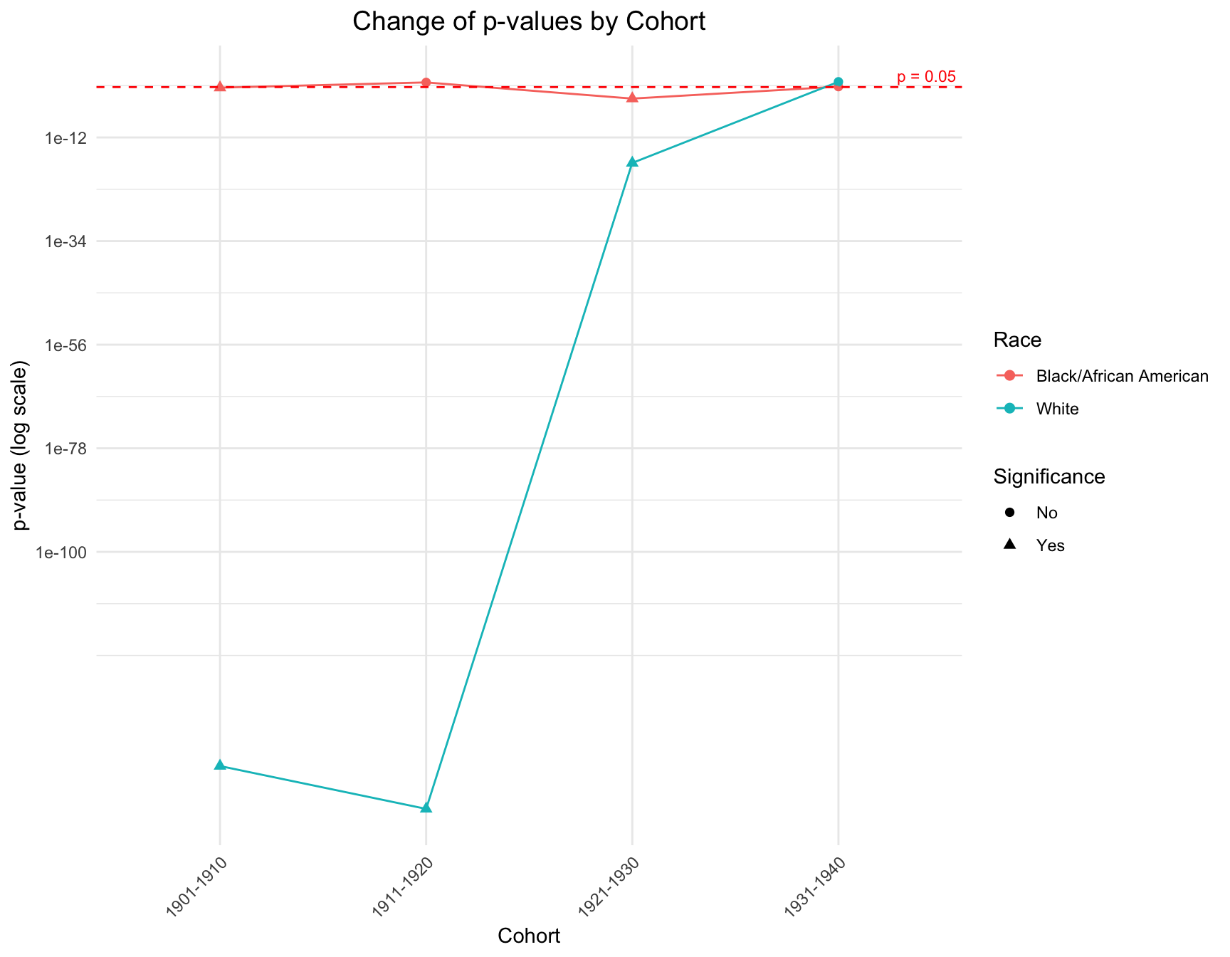
The graph shows that there is a discrepancy in the p-value within the cohorts like 1901-1910, 1911-1920 and 1921-1930 by race. However, in cohort 1931-1941, the p-value of each race is pretty close to each other. The overall trend of the p-value for black population is stable across cohort, while the trend for white population fluctuate a lot.
b. Family Size Analysis (Mean)
We apply t-test and ANOVA to check if there is a significant difference in the mean family size across the year for the same cohort. In both racial groups, the ANOVA and t-test are not applicable for the following cohort since there is only one census year available in the data for those cohorts:-Inf-1910, 1941-1950, -Inf-1920, -Inf-1890, -Inf-1900, and 1891-1900
merged_black = merged_data %>% filter(Race == "Black/African American")
merged_white = merged_data %>% filter(Race == "White")
test_result_b$p_value = format(test_result_b$p_value, scientific = TRUE)
kable(test_result_b, caption="Test Result of Mean Family Size for Black Population")| RACE | Cohort | Statistic | p_value | Significance | |
|---|---|---|---|---|---|
| 1 | Black/African American | 1911-1920 | 0.2935745 | 7.455953e-01 | No |
| t | Black/African American | 1901-1910 | 2.8577289 | 4.272684e-03 | Yes |
| 11 | Black/African American | 1921-1930 | 21.4153393 | 5.058954e-10 | Yes |
| t1 | Black/African American | 1931-1940 | -0.0665138 | 9.469694e-01 | No |
In the black population, the p-value of cohorts 1901-1910 and 1921-1930 are smaller than 0.05. These results indicate mean family size for these cohort has significantly changed over different census years in different racial population.
test_result_w$p_value = format(test_result_w$p_value, scientific = TRUE)

kable(test_result_w, caption="Test Result of Mean Family Size for White Population")| RACE | Cohort | Statistic | p_value | Significance | |
|---|---|---|---|---|---|
| 1 | White | 1911-1920 | 68.7034766 | 1.472553e-30 | Yes |
| t | White | 1901-1910 | 16.2673142 | 1.889832e-59 | Yes |
| 11 | White | 1921-1930 | 83.5688313 | 5.178495e-37 | Yes |
| t1 | White | 1931-1940 | 0.7361998 | 4.616101e-01 | No |
By looking at the ANOVA and t-test for mean family size in white population, the p-value of cohorts 1901-1910, 1911-1920 and 1921-1930 are smaller than 0.05.
c. Family Size Analysis (Variance)
We apply Levene’s test to check if there is significant difference in the variance of family size across year for the same cohort. In both racial group, the Levene’s test is not applicable for the following cohorts since there is only one census year available in the data for those cohorts:-Inf-1910, 1941-1950, -Inf-1920, -Inf-1890, -Inf-1900, and 1891-1900
kable(test_var_b, caption="Test Result of Variance of Family Size for Black Population")| RACE | Cohort | Statistic | p_value | Significance |
|---|---|---|---|---|
| Black/African American | 1911-1920 | 1.350323 | 0.2591689 | No |
| Black/African American | 1901-1910 | 8.331221 | 0.0039006 | Yes |
| Black/African American | 1921-1930 | 8.952631 | 0.0001296 | Yes |
| Black/African American | 1931-1940 | 2.780472 | 0.0954339 | No |
The table above summarizes the test result for black population. We observe that the variance of family size change significantly across census year in cohort 1901-1910 and 1921-1930.
kable(test_var_w, caption="Test Result of Variance of Family Size for White Population")| RACE | Cohort | Statistic | p_value | Significance |
|---|---|---|---|---|
| White | 1911-1920 | 26.3642465 | 0.0000000 | Yes |
| White | 1901-1910 | 2.1878497 | 0.1391048 | No |
| White | 1921-1930 | 0.5329233 | 0.5868872 | No |
| White | 1931-1940 | 3.5682027 | 0.0588976 | No |
This table summarizes the test result for white population. We observe that the variance of family size only change significantly across census year in cohort 1911-1920.
d. Model Fit Analysis
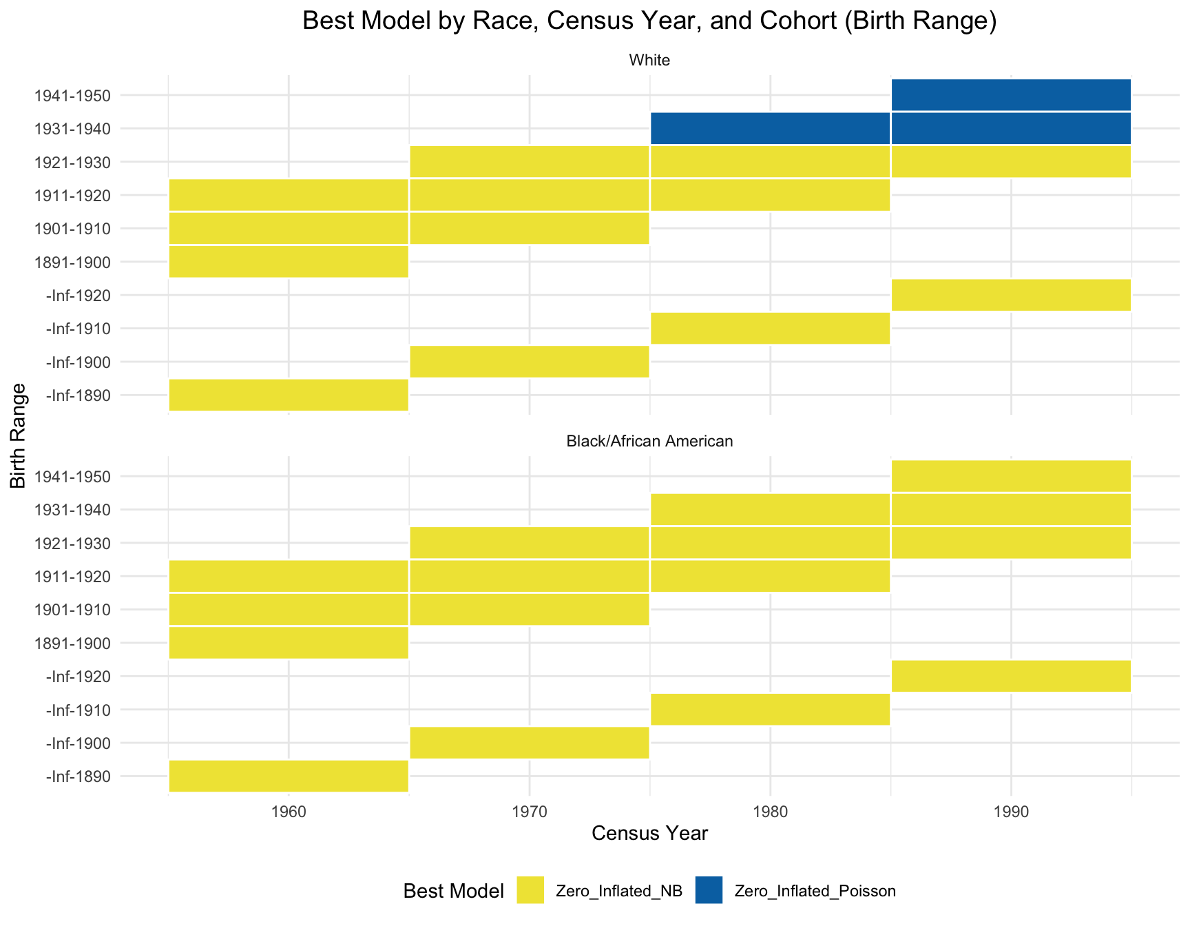
Due to the due lack of data variability, we use visualization instead of statistical test. Based on the heatmap created, we can see that the model fit for each cohort(cohort with 2+ corresponding census year) across year does not change.
# Due to the due lack of data variability, I use visualization instead of test

ggplot(best_models, aes(x = Census_Year, y = Cohort, fill = Best_Model)) +
  geom_tile(color = "white", lwd = 0.5, linetype = 1) + # Create the tiles
  facet_wrap(~Race, nrow = 2) + # Facet by Race
  scale_fill_manual(values = c("Zero_Inflated_Poisson" = "#0072B2", "Zero_Inflated_NB" = "#F0E442")) +
  labs(
    title = "Best Model by Race, Census Year, and Cohort (Birth Range)",
    x = "Census Year",
    y = "Birth Range",
    fill = "Best Model"
  ) +
  theme_minimal() +
  theme(
    plot.title = element_text(size = 14, hjust = 0.5),
    legend.position = "bottom"
  )
Analyzing and Visualizing Significant Fertility Shifts
The goal of this section is to summarize the previous information and create visualization that illustrates significant fertility shifts in cohorts, compares fertility patterns of 40-49 year-olds to 50-59 year-olds in the 1990 census so we can pick the set of fertility distributions we want to use to visualize the sibling distribution and do the math on the genetic surveillance.
Panel A: Fertility Distribution Shifts Across Cohorts
In this part, we’ll summarize the information from the cohort stability and create visualization that illustrates significant fertility shifts in cohorts. Cohorts that exhibit a significant change over time are represented with solid lines, while those with non-significant changes are depicted using dashed lines.
Significant Change in Zero Inflation
significant_black <- c("1901-1910", "1921-1930")
significant_white <- c("1901-1910", "1911-1920", "1921-1930")

combined_data <- bind_rows(proportions_df_b, proportions_df_w) %>%
  mutate(Race = factor(Race, levels = c("White", "Black"),
                       labels = c("White", "Black/African American")))

# Assign line styles
combined_data <- combined_data %>%
  mutate(Line_Style = ifelse((Race == "Black/African American" & Cohort %in%
                                significant_black) |
                             (Race == "White" & Cohort %in% significant_white),
                             "solid", "dashed"))

# Plot using ggplot2
ggplot(combined_data, aes(x = Census_Year, y = Proportion_Zero_Children, group = Cohort)) +
  geom_line(aes(linetype = Line_Style, color = Cohort), size = 1) +
  geom_point(aes(color = Cohort), size = 2) +
  facet_wrap(~Race) +
  scale_linetype_manual(
    name = "Significance",
    values = c("solid" = "solid", "dashed" = "dashed"),
    breaks = c("dashed", "solid"),
    labels = c("Non-significant", "Significant")
  ) +
  labs(title = "Significant Changes in Zero Inflation Over Census Years",
       x = "Census Year", y = "Proportion with Zero Children",
       color = "Cohort", linetype = "Significance") +
  theme_minimal() +
  theme(legend.position = "bottom",
        legend.key.size=unit(2,"lines"),
        plot.title = element_text(size = 14, hjust = 0.5))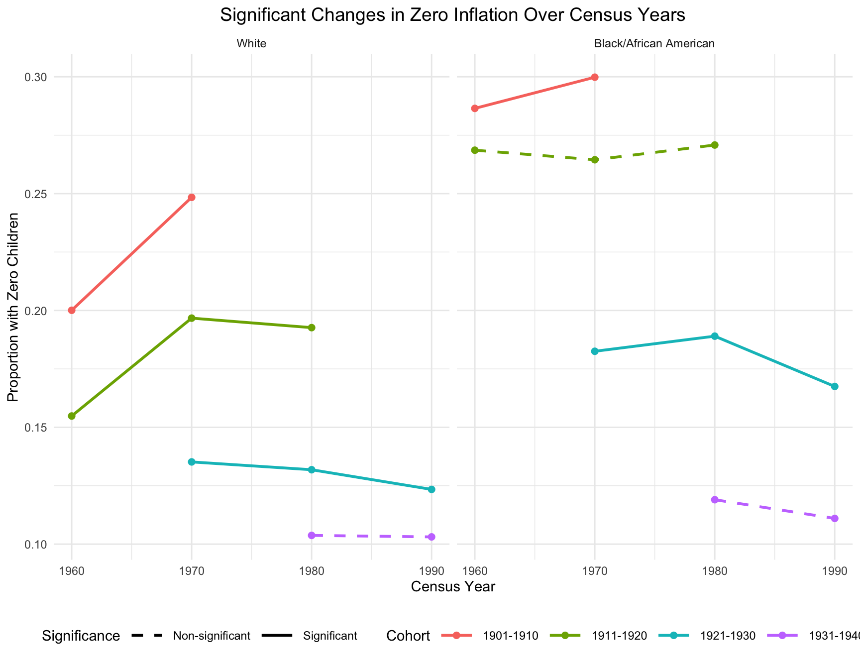
- In the black population, the most significant shifts in childlessness occurred between the 1960 and 1970 census years, where there is a sharp increase in the proportion of women with zero children. This trend continues more gradually between 1970 and 1990 but stabilizes for cohort 1921-1930.
- In the white population, the increase in childlessness is also visible between 1960 and 1970, but the magnitude of the increase is more pronounced compared to African American women. Childlessness stabilizes for cohort 1911-1920 and 1921-1930 between 1970 and 1990, with smaller fluctuations in later decades.
Significant Change in Mean Family Size
merged_data2 <- left_join(merged_data, summary_table, by = c("Race","Cohort","Census_Year")) %>% dplyr::select(Race, Cohort, Census_Year, Mean, Variance)

combined_data <- unique(merged_data2) %>% filter(Cohort %in% c("1901-1910", "1911-1920", "1921-1930", "1931-1940"))

# Assign line styles
combined_data <- combined_data %>%
  mutate(Line_Style = ifelse((Race == "Black/African American" & Cohort %in%
                                significant_black) |
                             (Race == "White" & Cohort %in% significant_white),
                              "Significant", "Non-significant"))

ggplot(combined_data, aes(x = Census_Year, y = Mean, group = Cohort)) +
  geom_line(aes(linetype = Line_Style, color = Cohort), size = 1) +
  geom_point(aes(color = Cohort), size = 2) +
  facet_wrap(~Race) +
  scale_linetype_manual(values = c("Significant" = "solid", "Non-significant" = "dashed")) +
  labs(title = "Significant Changes in Mean Family Size Over Census Years",
       x = "Census Year", y = "Mean of number of Children",
       color = "Cohort", linetype = "Significance") +
  theme_minimal() +
  theme(legend.position = "bottom",
        legend.key.size=unit(2,"lines"),
        plot.title = element_text(size = 14, hjust = 0.5))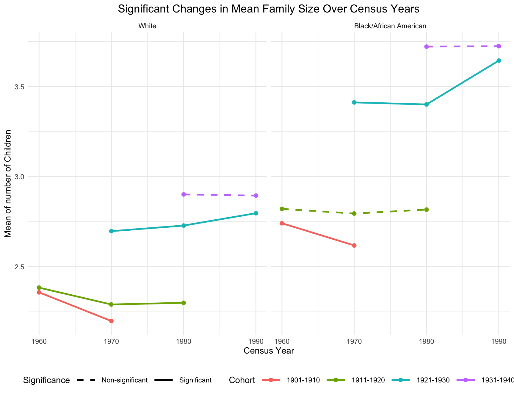
- For black population, the mean family size for the 1921-1930 cohort increased substantially in 1990, reaching over 3.6 children on average. However, both cohorts exhibited little change in mean family size in earlier census year (between 1960 and 1980).
- For white population, a consistent decline in mean family size was observed for the 1901-1910 and 1911-1920 cohorts from 1960 to 1970. The 1921-1930 cohort showed a modest increase in mean family size in 1990, reaching around 2.8 children on average, which is smaller than the black population.
Significant Change in Variance of Family Size
significant_black <- c("1901-1910", "1921-1930")
significant_white <- c("1911-1920")

combined_data <- unique(merged_data2) %>% filter(Cohort %in% c("1901-1910", "1911-1920", "1921-1930", "1931-1940"))

# Assign line styles
combined_data <- combined_data %>%
  mutate(Line_Style = ifelse((Race == "Black/African American" & Cohort %in%
                                significant_black) |
                             (Race == "White" & Cohort %in% significant_white),
                              "Significant", "Non-significant"))


ggplot(combined_data, aes(x = Census_Year, y = Variance, group = Cohort)) +
  geom_line(aes(linetype = Line_Style, color = Cohort), size = 1) +
  geom_point(aes(color = Cohort), size = 2) +
  facet_wrap(~Race) +
  scale_linetype_manual(values = c("Significant" = "solid", "Non-significant" = "dashed")) +
  labs(title = "Significant Changes in Variance of Family Size Over Census Years",
       x = "Census Year", y = "Variance of number of Children",
       color = "Cohort", linetype = "Significance") +
  theme_minimal() +
  theme(legend.position = "bottom",
        legend.key.size=unit(2,"lines"),
        plot.title = element_text(size = 14, hjust = 0.5))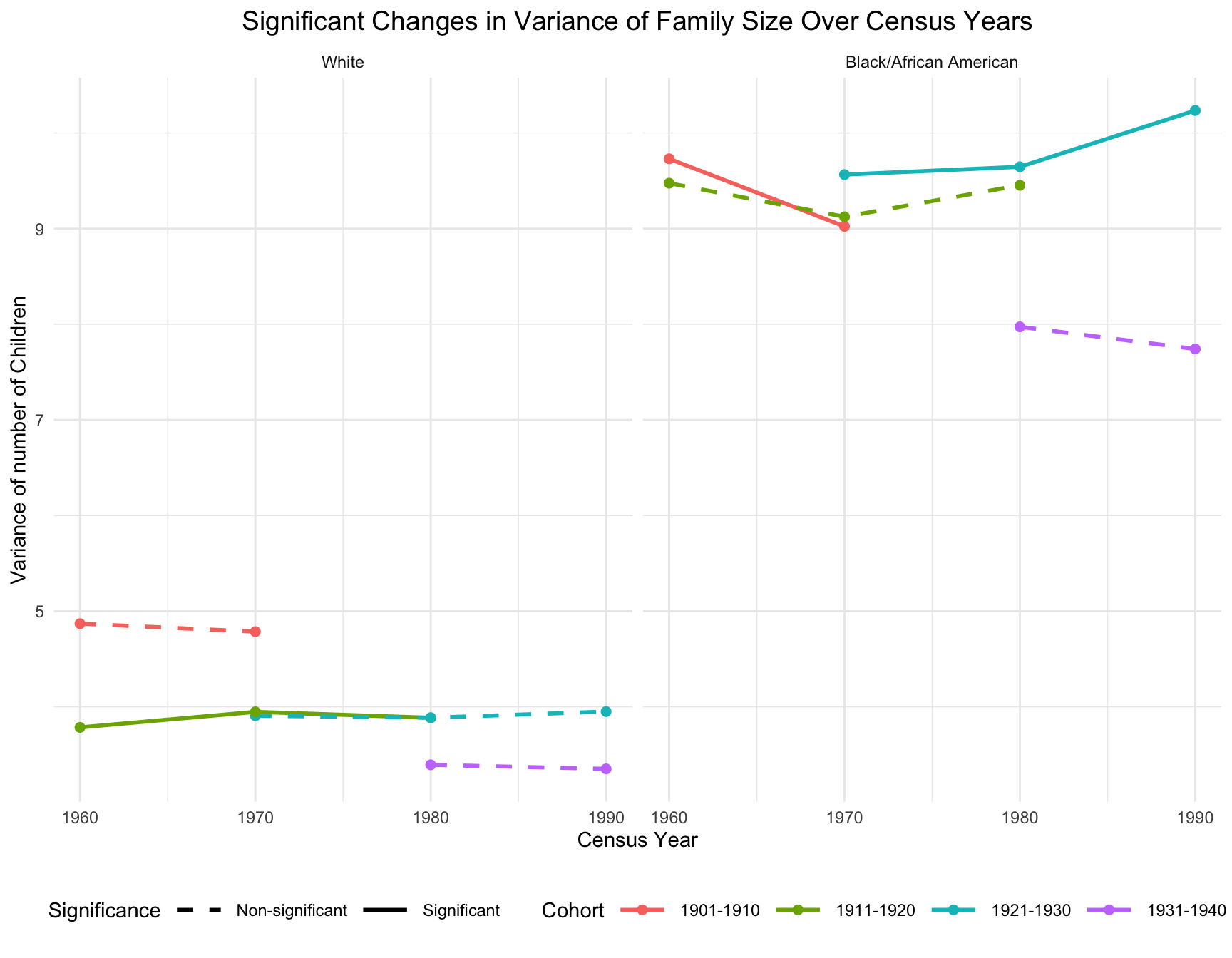
- For black population, significant decrease in variance occur between 1960 and 1970, particularly for the cohort 1901-1910. Variance continues to shift for cohort 1921-1930 between 1970 and 1990 with the steeper increases.
- For white population, there is little change in variance over time. Variance appears to remain stable across Census years for cohort 1911-1920. This stability suggests less variability in fertility patterns among women in white population compared to black population.
Panel B: Comparison of 40-49 and 50-59 Age Groups in 1990
This analysis examines differences in fertility patterns between the 40-49 and 50-59 age groups in 1990, focusing on the distribution, mean number of children, variance, and childlessness (zero inflation) within Black and White populations.
Visulization of Distribution
Firstly, we present a side-by-side distribution plots comparing the number of children for women in the 40-49 and 50-59 age groups within Black and White populations.
filter_df <- df_proportions %>%
  filter(YEAR == "1990", AGE_RANGE %in% c("40-49", "50-59"))
ggplot(filter_df, aes(x = chborn_num, y = proportion, fill = AGE_RANGE)) +
geom_col(position = "identity", alpha = 0.5) +
facet_wrap(~ RACE) +
labs(
title = "Distribution of Number of Children for Women in 40-49 and 50-59 Age Groups in 1990",
x = "Number of Children",
y = "Proportion",
fill = "Age Range"
) +
theme(
plot.title = element_text(size = 14, hjust = 0.5))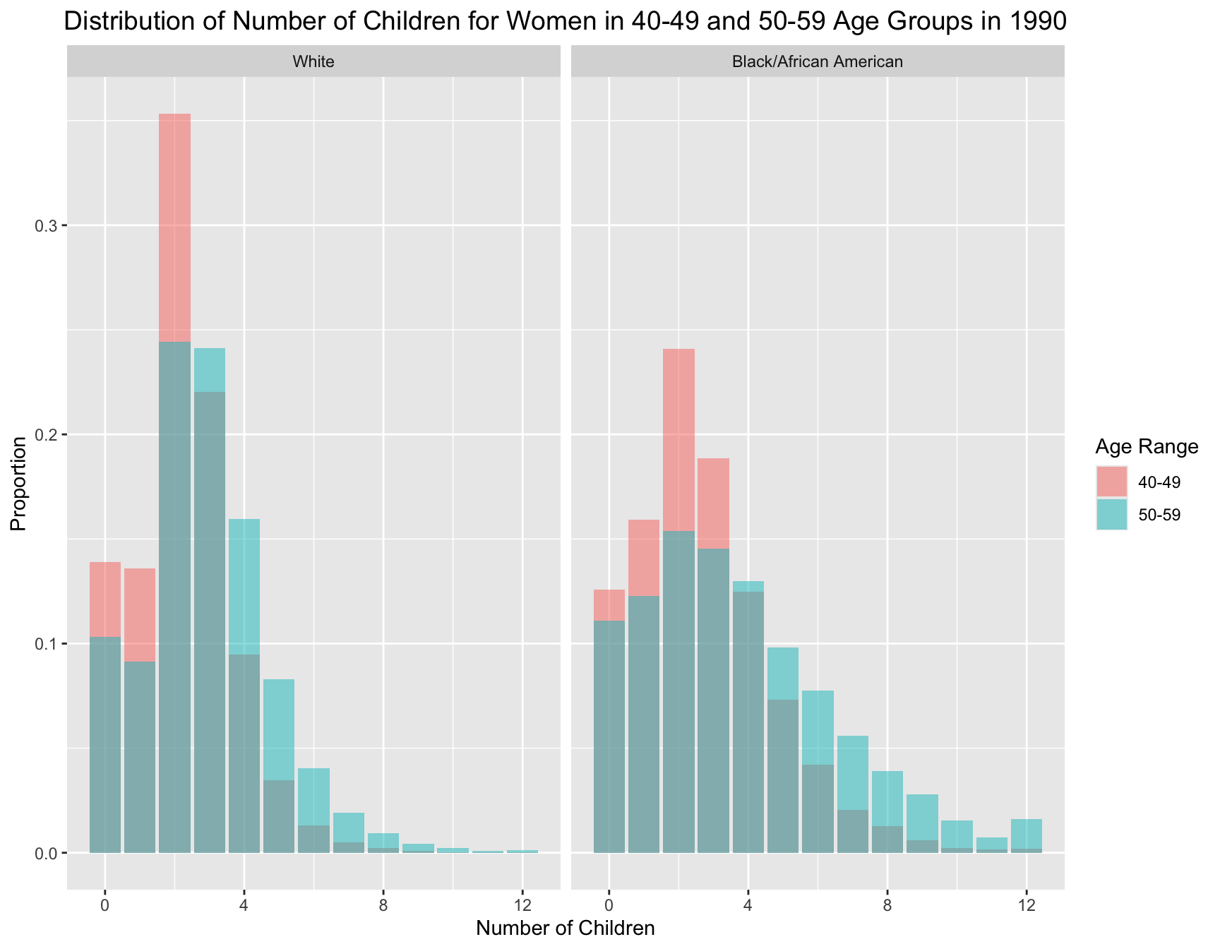
For both racial groups, the 40-49 age group has a distribution more skewed towards 0-2 children. Meanwhile, women in the 50-59 age group generally have larger family sizes compared to the 40-49 age group.
Summary Statistics Table
By summarizing the key statistics for each age group and race, we can derive the same insight, which shows that women in the older age group have larger family sizes. On average, women in the 50-59 age group have more children than those in the 40-49 age group. In addition, the variance in the number of children is larger for the 50-59 age group in both racial groups, indicating greater variability in family size. In terms of zero inflation (proportion of women with no children), the women in 40-49 age group have higher zero inflation than women in 50-59 in both racial groups.
summary_stats <- filter_df %>%
  group_by(AGE_RANGE, RACE) %>%
  summarise(
    mean_children = weighted.mean(chborn_num, count),  # Mean number of children
    variance_children = sum(count * (chborn_num - weighted.mean(chborn_num, count))^2) / sum(count),  # Variance
    zero_inflation = sum(count[chborn_num == 0]) / sum(count), .groups = "drop"
  )

# Print summary statistics table
kable(summary_stats, caption= "Summary Statistics of Number of Children in 1990 (40-49 and 50-59 Age Group)")| AGE_RANGE | RACE | mean_children | variance_children | zero_inflation |
|---|---|---|---|---|
| 40-49 | White | 2.204755 | 2.090605 | 0.1389518 |
| 40-49 | Black/African American | 2.690402 | 3.955086 | 0.1258126 |
| 50-59 | White | 2.894691 | 3.351643 | 0.1031027 |
| 50-59 | Black/African American | 3.723892 | 7.740850 | 0.1110096 |
Test for Difference in Variances
We firstly plot the diagnostic plot to see if the data fulfill the normality assumption. The result shows the data for black population and white population violate normality assumption, so we apply Levene’s test since non-normality in data.
- Null Hypothesis (H₀): There is no difference in the variance of the number of children between the two age groups.
- Alternative Hypothesis (H₁): There is a difference in the variance of the number of children between the two age groups.
df_w <- df %>% filter(RACE == "White"& AGE_RANGE %in% c("40-49", "50-59") & YEAR == "1990")
df_b <- df %>% filter(RACE == "Black/African American" & AGE_RANGE %in% c("40-49", "50-59") & YEAR == "1990")

## Apply Levene's test since non-normality
# Levene's test for Black group
levene_test_b <- leveneTest(chborn_num ~ as.factor(AGE_RANGE), data = df_b)

# Levene's test for White group
levene_test_w <- leveneTest(chborn_num ~ as.factor(AGE_RANGE), data = df_w)

res_df2 <- data.frame(
  race = c("African American", "European American"),
  p_value = format(c(levene_test_b[["Pr(>F)"]][1], levene_test_w[["Pr(>F)"]][1]), scientific = TRUE)
)

kable(res_df2, caption="Test Result for Difference in Variance between Age Groups By Race")| race | p_value |
|---|---|
| African American | 1.135594e-212 |
| European American | 0.000000e+00 |
Since the p values are smaller than 0.05 for both racial group, we have enough evidence to reject the null hypothesis, indicating that the variances of the number of children between the two age groups within each racial group are significantly different.
Test for Difference in Means
According to the results from previous parts, which indicate a violation of normality and equal variance, we choose to use the Mann-Whitney U test to check if the mean number of children are statistically different between age groups.
- Null Hypothesis (H₀): There is no difference in the mean number of children between the two age groups.
- Alternative Hypothesis (H₁): There is a difference in the mean number of children between the two age groups.
df_40_49_w <- df_w %>% filter(AGE_RANGE == "40-49") %>% pull(chborn_num)
df_50_59_w <- df_w %>% filter(AGE_RANGE == "50-59") %>% pull(chborn_num)

# Perform Mann-Whitney U test (Wilcoxon rank-sum test in R)
t_test_w<-wilcox.test(df_40_49_w, df_50_59_w, alternative = "two.sided")$p.value

df_40_49_b <- df_b %>% filter(AGE_RANGE == "40-49") %>% pull(chborn_num)
df_50_59_b <- df_b %>% filter(AGE_RANGE == "50-59") %>% pull(chborn_num)

# Perform Mann-Whitney U test (Wilcoxon rank-sum test in R)
t_test_b<-wilcox.test(df_40_49_b, df_50_59_b, alternative = "two.sided")$p.value

res_df <- data.frame(
  race = c("African American", "European American"),
  p_value = c(t_test_b, t_test_w)
)
res_df$p_value <- format(res_df$p_value, scientific = TRUE)

kable(res_df, caption="Test Result for Difference in Variance between Age Groups By Race")| race | p_value |
|---|---|
| African American | 5.924427e-169 |
| European American | 0.000000e+00 |
The p-values are both extremely small, meaning there is a very strong statistical difference between the two age groups (40-49 and 50-59) in terms of the mean number of children within each racial group.
Test for Difference in Zero Inflation
To test the difference in zero inflation between age group, we firstly create a contingency tables showing the counts of women with zero children and those with one or more children for each age group. Then we apply chi-square test within each race.
- Null Hypothesis (H₀): There is no difference in the proportion of childlessness between the two age groups.
- Alternative Hypothesis (H₁): There is a difference in the proportion of childlessness between the two age groups.
# contingency tables showing the counts of women with zero children and those with one or more children for each age group
ZI_table <- df %>% filter(YEAR == "1990", AGE_RANGE %in% c("40-49", "50-59")) %>%
  mutate(childlessness = ifelse(chborn_num == 0, "0 Children", "1+ Children")) %>%       group_by(RACE, AGE_RANGE, childlessness) %>%
  summarise(count = n(), .groups = "drop")

kable(ZI_table, caption="Contingency Table of Zero Inflation")| RACE | AGE_RANGE | childlessness | count |
|---|---|---|---|
| White | 40-49 | 0 Children | 15945 |
| White | 40-49 | 1+ Children | 98807 |
| White | 50-59 | 0 Children | 9906 |
| White | 50-59 | 1+ Children | 86173 |
| Black/African American | 40-49 | 0 Children | 1645 |
| Black/African American | 40-49 | 1+ Children | 11430 |
| Black/African American | 50-59 | 0 Children | 1215 |
| Black/African American | 50-59 | 1+ Children | 9730 |
ZI_table_b <- ZI_table %>%
  filter(RACE == "Black/African American")

cont_table_b <- xtabs(count ~ AGE_RANGE + childlessness, data = ZI_table_b)
chi_test_b <- chisq.test(cont_table_b)
ZI_table_w <- ZI_table %>%
filter(RACE == "White")
cont_table_w <- xtabs(count ~ AGE_RANGE + childlessness, data = ZI_table_w)
chi_test_w <- chisq.test(cont_table_w)res_df3 <- data.frame(
race = c("African American", "European American"),
p_value = format(c(chi_test_b$p.value, chi_test_w$p.value), scientific = TRUE))
kable(res_df3, caption="Test Result for Zero Inflation between Age Groups By Race")| race | p_value |
|---|---|
| African American | 4.515422e-04 |
| European American | 8.347360e-138 |
The p-values for both tests are extremely low, suggests that there is a significant difference in the proportion of women with 0 children across age ranges (40-49 vs. 50-59) for both the Black/African American and White racial groups. The results imply that childlessness is not uniformly distributed across age groups.
Conclusion
The results of this panel provide clear evidence of significant differences in fertility patterns between the 40-49 and 50-59 age groups for both Black and White populations:
- Mean Number of Children: Women in the 50-59 age group have significantly more children on average than those in the 40-49 age group (difference: 1.03 for Black women and 0.69 for White women).
- Variance: The 50-59 age group exhibits greater variability in family sizes.
- Zero Inflation: The 40-49 age group has a higher proportion of childlessness.
These findings highlight generational differences in fertility patterns, with older age groups (50-59) reflecting larger family sizes and greater variability.
Implication
These findings suggest notable shifts in fertility trends and behaviors across generations: - The 50-59 age group likely represents completed fertility patterns, where women have finished childbearing. This explains the higher mean number of children and greater variance observed in this group. - The 40-49 age group, on the other hand, may still include women who have not yet completed their fertility, leading to a higher proportion of childlessness and a distribution skewed towards smaller family sizes. - These trends may reflect broader social, economic, and cultural influences on family size, such as changes in education, workforce participation, and access to family planning resources across generations.
Distribution of Number of Siblings Across Census Years
Having analyzed the distribution of the number of children, we now turn our attention to the distribution of the number of siblings. We will explore the trends in the frequency of the number of siblings for African American and European American mothers across the Census years by age group.
Frequency of siblings is calculated as follows.
\[ \text{freq}_{n_{\text{sib}}} = \text{freq}_{\text{mother}} \cdot \text{chborn}_{\text{num}} \]
For example, suppose 10 mothers (generation 0) have 7 children, then there will be 70 children (generation 1) in total who each have 6 siblings.
We take our original data and calculate the frequency of siblings for each mother based on the number of children they have. We then aggregate this data to get the frequency of siblings for each generation along with details on the birth years of the relevant children to visualize the distribution of the number of siblings across generations.
Data Preparation
Firstly, we calculate the number of sibling by subtracting 1 from number of children. Then, we group the data to calculate sibling frequencies and check the normalization by calculating the proportion of sibling frequencies in each combination of census year, race and age range.
df2 <- df %>%
  dplyr::select(RACE, YEAR, AGE_RANGE, chborn_num)
df2 <- df2 %>%
mutate(n_siblings = chborn_num - 1)### Calculate Sibling Frequencies
df2 <- df2 %>%
mutate(sibling_freq = ifelse(chborn_num != 1, chborn_num*1, 1)) # Assuming each mother represents 1 in frequency### Aggregate Sibling Data
# Group the data and calculate sibling frequencies
df_siblings <- df2 %>%
group_by(YEAR, RACE, AGE_RANGE, n_siblings) %>%
summarise(
sibling_count = sum(sibling_freq),
.groups = "drop"
)# Calculate proportions within each group
df_sibling_proportions <- df_siblings %>%
group_by(YEAR, RACE, AGE_RANGE) %>%
mutate(proportion = sibling_count / sum(sibling_count)) %>%
ungroup()### Check Normalization
normalization_check <- df_sibling_proportions %>%
group_by(YEAR, RACE, AGE_RANGE) %>%
summarise(total_proportion = sum(proportion), .groups = "drop") %>%
arrange(YEAR, RACE, AGE_RANGE)Visualization of Distribution of Number of Siblings
Then we visualize the general trends in the frequency of the number of siblings for African American and European American mothers across the Census years by age group.
df_sibling_mirror <- df_sibling_proportions %>%
  mutate(proportion = if_else(RACE == "White", -proportion, proportion))
my_colors <- colorRampPalette(c("#FFB000", "#F77A2E", "#DE3A8A", "#7253FF", "#5E8BFF"))(13)ggplot(data = df_sibling_mirror %>% filter(n_siblings != "-1"), aes(x = n_siblings, y = proportion, fill = as.factor(n_siblings))) +
geom_col(aes(alpha = RACE)) +
geom_hline(yintercept = 0, color = "black", size = 0.5) +
facet_grid(AGE_RANGE ~ YEAR, scales = "free_y") +
coord_flip() +
scale_y_continuous(
labels = function(x) abs(x),
limits = function(x) c(-max(abs(x)), max(abs(x)))
) +
scale_x_continuous(breaks = 0:11, labels = c(0:10, "11+")) +
scale_fill_manual(values = my_colors) +
scale_alpha_manual(values = c("White" = 0.7, "Black/African American" = 1)) +
labs(
title = "Distribution of Number of Siblings by Census Year, Race, and Age Range",
x = "Number of Siblings",
y = "Proportion",
fill = "Number of Siblings",
caption = "White population shown on left (negative values), Black/African American on right (positive values)\nProportions normalized within each age range, race, and census year\nFootnote: The category '11+' includes individuals with 11 or more siblings."
) +
theme_minimal() +
theme(
plot.title = element_text(size = 14, hjust = 0.5),
axis.text.y = element_text(size = 8),
strip.text = element_text(size = 10),
legend.position = "none",
panel.grid.major.y = element_blank(),
panel.grid.minor.y = element_blank()
)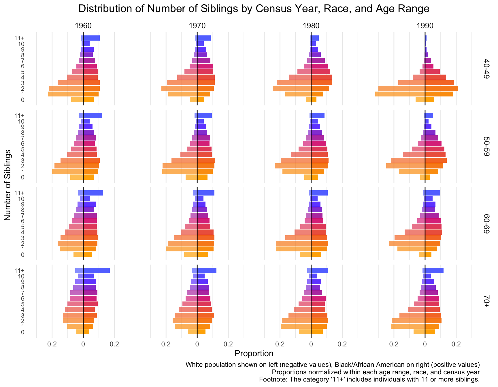
With this visualization of the distribution of the data, we can see that there are differences between races, census year and age groups. Note: The category ‘11+’ includes individuals with 11 or more siblings.
- By Census Year:
- In 1960 and 1970, individuals are more likely to have higher number of siblings, especially in the 5-10 range. This trend diminishes over time.
- By 1980 and 1990, the distribution shifts toward smaller family sizes, with a growing proportion of individuals having fewer siblings.
- By Age Range:
- 40-49 Age Group: For this group, the number of individuals with 0-2 siblings increases across census years, especially in 1990, while the proportion of individuals with larger sibling counts decreases.
- 50-59 and 60-69 Age Groups: These groups show a similar shift toward smaller family sizes, but the trend is slightly more gradual compared to the younger age group.
- 70+ Age Group: The shift to fewer siblings is noticeable, although the trend is less pronounced. The distribution remains relatively stable across the census years, with a significant portion of individuals still coming from large families in 1960 and 1970.
- By Race: Black/African American Populations (right side of each pair) consistently show a higher proportion of individuals with larger sibling counts (5-10 siblings) compared to White populations. However, similar to the White population, the number of individuals with fewer siblings increases over time.
Comparing the sibling distribution with the children distribution, we find that although both distributions show a trend toward smaller families, the sibling distribution is more spread out across different sibling counts, suggesting potential difference in the distribution.
Model Fit Across Census Years
We repeat the model fitting process we performed for the children distribution, this time using the sibling distribution data.
combinations2 <- df2 %>%
  # treat number of sib = -1 as NA
  filter(n_siblings != -1) %>%
  group_by(YEAR, RACE, AGE_RANGE) %>%
  group_split()

# Initialize the data frame to store results
best_models_sib <- data.frame(
  Race = character(),
  Census_Year = numeric(),
  AGE_RANGE = character(),
  AIC_poisson = numeric(),
  AIC_nb = numeric(),
  AIC_zip = numeric(),
  AIC_zinb = numeric(),
  stringsAsFactors = FALSE
)

# Loop through each subset of data
for (i in seq_along(combinations2)) {
  subset_data <- combinations2[[i]]

  # Fit Poisson model
  poisson_model <- glm(n_siblings ~ 1, family = poisson, data = subset_data)
  # Fit Negative Binomial model
  nb_model <- glm.nb(n_siblings ~ 1, data = subset_data)

  # Fit Zero-Inflated Poisson model
  zip_model <- zeroinfl(n_siblings ~ 1 | 1, data = subset_data, dist = "poisson",control = zeroinfl.control(maxit = 100))

  # Fit Zero-Inflated Negative Binomial model with increased max iterations
  zinb_model <- zeroinfl(n_siblings ~ 1 | 1, data = subset_data, dist = "negbin",control = zeroinfl.control(maxit = 100))

  # Append the result to the best_models data frame
  best_models_sib <- rbind(
    best_models_sib,
    data.frame(
      Race = unique(subset_data$RACE),
      Census_Year = unique(subset_data$YEAR),
      AGE_RANGE = unique(subset_data$AGE_RANGE),
      AIC_poisson = AIC(poisson_model),
      AIC_nb = AIC(nb_model),
      AIC_zip = AIC(zip_model),
      AIC_zinb = AIC(zinb_model),
      stringsAsFactors = FALSE
    )
  )
}
Fit and Compare Models
For each combination, we again fit the following candidate models:
- Poisson Model
- Negative Binomial (NB) Model
- Zero-Inflated Poisson (ZIP) Model
- Zero-Inflated Negative Binomial (ZINB) Model
Record the Best Model for Each Subset
Then, we find the AIC value of four models for each combination and record the model with minimum AIC. The following is the table that summarize the best model for each combination of race, census year and age group.
kable(best_models_sib, caption="Summary Table of Best Model (Siblings)")| Race | Census_Year | AGE_RANGE | Best_Model |
|---|---|---|---|
| White | 1960 | 40-49 | Negative_Binomial |
| White | 1960 | 50-59 | Negative_Binomial |
| White | 1960 | 60-69 | Negative_Binomial |
| White | 1960 | 70+ | Negative_Binomial |
| Black/African American | 1960 | 40-49 | Zero_Inflated_NB |
| Black/African American | 1960 | 50-59 | Zero_Inflated_NB |
| Black/African American | 1960 | 60-69 | Zero_Inflated_NB |
| Black/African American | 1960 | 70+ | Zero_Inflated_NB |
| White | 1970 | 40-49 | Negative_Binomial |
| White | 1970 | 50-59 | Negative_Binomial |
| White | 1970 | 60-69 | Negative_Binomial |
| White | 1970 | 70+ | Negative_Binomial |
| Black/African American | 1970 | 40-49 | Zero_Inflated_NB |
| Black/African American | 1970 | 50-59 | Zero_Inflated_NB |
| Black/African American | 1970 | 60-69 | Zero_Inflated_NB |
| Black/African American | 1970 | 70+ | Zero_Inflated_NB |
| White | 1980 | 40-49 | Negative_Binomial |
| White | 1980 | 50-59 | Negative_Binomial |
| White | 1980 | 60-69 | Negative_Binomial |
| White | 1980 | 70+ | Negative_Binomial |
| Black/African American | 1980 | 40-49 | Zero_Inflated_NB |
| Black/African American | 1980 | 50-59 | Zero_Inflated_NB |
| Black/African American | 1980 | 60-69 | Zero_Inflated_NB |
| Black/African American | 1980 | 70+ | Zero_Inflated_NB |
| White | 1990 | 40-49 | Poisson |
| White | 1990 | 50-59 | Negative_Binomial |
| White | 1990 | 60-69 | Negative_Binomial |
| White | 1990 | 70+ | Negative_Binomial |
| Black/African American | 1990 | 40-49 | Negative_Binomial |
| Black/African American | 1990 | 50-59 | Zero_Inflated_NB |
| Black/African American | 1990 | 60-69 | Zero_Inflated_NB |
| Black/African American | 1990 | 70+ | Zero_Inflated_NB |
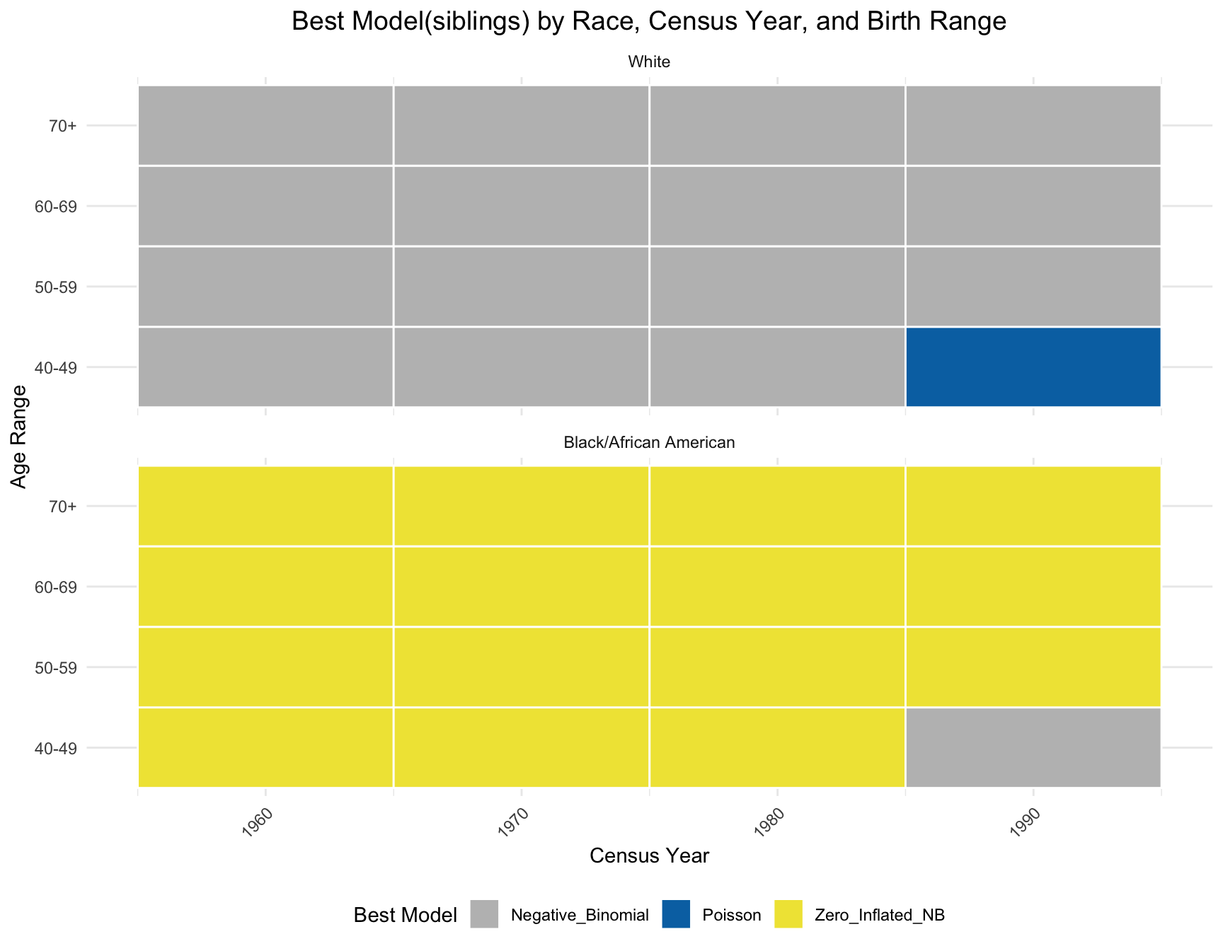
Visualize the Results
By comparing the pattern of best-fitting models between the sibling and children distributions, we observe that the best model for black population has the same best model(zero-inlfated NB) across year and age range except on one subset(age 40-49 in 1990) in siblings distribution. However, there is a large difference in best model for white population. A large portion of best model in children distribution for white population is zero-inlfated NB, while negative-binomial is the best model fitted for siblings distribution except for one subset(age 40-49 in 1990).
ggplot(best_models_sib, aes(x = Census_Year, y = AGE_RANGE, fill = Best_Model)) +
  geom_tile(color = "white", lwd = 0.5, linetype = 1) + # Create the tiles
  facet_wrap(~Race, nrow = 2) + # Facet by Race
  scale_fill_manual(values = c("Poisson" = "#0072B2", "Zero_Inflated_NB" = "#F0E442", "Negative_Binomial" = "grey")) +
  labs(
    title = "Best Model(siblings) by Race, Census Year, and Birth Range",
    x = "Census Year",
    y = "Age Range",
    fill = "Best Model"
  ) +
  theme_minimal() +
  theme(
    axis.text.x = element_text(angle = 45, hjust = 1),
    plot.title = element_text(size = 14, hjust = 0.5),
    legend.position = "bottom"
  )
Cohort Stability Analysis Siblings
Next, we analyze the stability of sibling distributions across year for each cohorts, similar to the analysis performed for children.
- Zero Inflation: Check if the proportion of individuals with zero siblings changes significantly over time for the same cohort
- Family Size: Test if the mean in the number of siblings changes for the same cohort over time.
- Model Fit: Analyze if the best-fitting model for the cohort changes over time.
a. Zero-Inflation Analysis
We apply the chi-square test for each cohort within each race. Since some cohorts only have one corresponding census year, the test is not applicable for them.
best_models_sib <- best_models_sib %>%
  mutate(Cohort = mapply(calculate_cohort, Census_Year, AGE_RANGE)) %>%
  dplyr::select(Race, Census_Year, AGE_RANGE, Best_Model, Cohort)

df_merg2 <- df2 %>%
  rename(Census_Year = YEAR, Race = RACE)

# Perform a left join to merge the data frames
merged_data_sib <- left_join(df_merg2, best_models_sib, by = c("Race", "Census_Year", "AGE_RANGE"))
## divided the corhort by race
merged_df_black2 <- merged_data_sib %>% filter(Race == "Black/African American")
merged_df_white2 <- merged_data_sib %>% filter(Race == "White")# Filter cohorts with more than one census year
cohort_counts <- merged_df_black2 %>%
group_by(Cohort) %>%
summarise(Unique_Census_Years = n_distinct(Census_Year)) %>%
filter(Unique_Census_Years > 1)
# Get the list of cohorts for testing
cohorts_for_test <- cohort_counts$Cohort
# Initialize results data frame
results_black2 <- data.frame(RACE = character(), Cohort = character(), Chi_Square = numeric(), p_value = numeric(), stringsAsFactors = FALSE)
# Loop through each cohort and run the chi-square test
for (cohort in cohorts_for_test) {
cohort_data <- merged_df_black2 %>% filter(Cohort == cohort)
# Create contingency table
contingency_table <- table(cohort_data$Census_Year, cohort_data$n_siblings == "0")
# Perform the chi-square test only if more than one row is in the table
if (nrow(contingency_table) > 1) {
test_result <- chisq.test(contingency_table)
# Append results to the results data frame
results_black2 <- rbind(results_black2, data.frame(
RACE = "Black/African American",
Cohort = cohort,
Chi_Square = test_result$statistic,
p_value = test_result$p.value
))
}
}
results_black2 <- results_black2 %>%
mutate(Significance = ifelse(p_value > 0.05, "No", "Yes"))
kable(results_black2, caption="Test Result of Zero Inflation for Black Population")| RACE | Cohort | Chi_Square | p_value | Significance | |
|---|---|---|---|---|---|
| X-squared | Black/African American | 1901-1910 | 2.7595148 | 0.0966776 | No |
| X-squared1 | Black/African American | 1911-1920 | 3.1588986 | 0.2060886 | No |
| X-squared2 | Black/African American | 1921-1930 | 6.4474388 | 0.0398067 | Yes |
| X-squared3 | Black/African American | 1931-1940 | 0.8166152 | 0.3661717 | No |
The table shows that only the cohort 1921-1930 has significant change in probability of individuals with zero siblings in black population.
# Filter cohorts with more than one census year
cohort_counts <- merged_df_white2 %>%
  group_by(Cohort) %>%
  summarise(Unique_Census_Years = n_distinct(Census_Year)) %>%
  filter(Unique_Census_Years > 1)

# Get the list of cohorts for testing
cohorts_for_test <- cohort_counts$Cohort

# Initialize results data frame
results_white2 <- data.frame(RACE = character(), Cohort = character(), Chi_Square = numeric(), p_value = numeric(), stringsAsFactors = FALSE)

# Loop through each cohort and run the chi-square test
for (cohort in cohorts_for_test) {
  cohort_data <- merged_df_white2 %>% filter(Cohort == cohort)

  # Create contingency table
  contingency_table <- table(cohort_data$Census_Year, cohort_data$n_siblings == "0")

  # Perform the chi-square test only if more than one row is in the table
  if (nrow(contingency_table) > 1) {
    test_result <- chisq.test(contingency_table)

    # Append results to the results data frame
    results_white2 <- rbind(results_white2, data.frame(
      RACE = "White",
      Cohort = cohort,
      Chi_Square = test_result$statistic,
      p_value = test_result$p.value
    ))
  }
}

results_white2 <- results_white2 %>%
  mutate(Significance = ifelse(p_value > 0.05, "No", "Yes"))

kable(results_white2, caption="Test Result of Zero Inflation for White Population")| RACE | Cohort | Chi_Square | p_value | Significance | |
|---|---|---|---|---|---|
| X-squared | White | 1901-1910 | 46.930953 | 0.0000000 | Yes |
| X-squared1 | White | 1911-1920 | 120.015146 | 0.0000000 | Yes |
| X-squared2 | White | 1921-1930 | 79.061387 | 0.0000000 | Yes |
| X-squared3 | White | 1931-1940 | 2.776021 | 0.0956856 | No |
The table shows that cohorts 1901-1910, 1911-1920, 1921-1930 have significant change in probability of individuals with zero siblings in white population.
b. Family Size Analysis (Mean)
We apply t-test and ANOVA to check if there is a significant difference in the mean family size across the year for the same cohort.
sum_table_black = merged_data_sib %>% filter(Race == "Black/African American" & n_siblings!=-1)
sum_table_white = merged_data_sib %>% filter(Race == "White"& n_siblings!=-1)
kable(test_result_b2, caption = "Test Result of Mean Family Size for Black Population")| RACE | Cohort | Statistic | p_value | Significance | |
|---|---|---|---|---|---|
| 1 | Black/African American | 1911-1920 | 1.420923 | 0.2415084 | No |
| t | Black/African American | 1901-1910 | 2.041113 | 0.0412638 | Yes |
| 11 | Black/African American | 1921-1930 | 13.940627 | 0.0000009 | Yes |
| t1 | Black/African American | 1931-1940 | 0.951569 | 0.3413272 | No |
The table shows that mean number of siblings change significantly in cohorts 1901-1910 and 1921-1930 in black population.
kable(test_result_w2, caption = "Test Result of Mean Family Size for White Population")| RACE | Cohort | Statistic | p_value | Significance | |
|---|---|---|---|---|---|
| 1 | White | 1911-1920 | 7.438832 | 0.0005881 | Yes |
| t | White | 1901-1910 | 2.126441 | 0.0334685 | Yes |
| 11 | White | 1921-1930 | 46.149409 | 0.0000000 | Yes |
| t1 | White | 1931-1940 | 1.151129 | 0.2496808 | No |
The mean number of siblings change significantly in cohorts 1901-1910, 1911-1920, 1921-1930 in white population.
c. Family Size Analysis (Variance)
We apply Levene’s test to check if there is significant difference in the variance of family size across year for the same cohort.
kable(test_var_b2, caption="Test Result of Variance of Family Size for Black Population")| RACE | Cohort | Statistic | p_value | Significance |
|---|---|---|---|---|
| Black/African American | 1911-1920 | 2.158523 | 0.1155149 | No |
| Black/African American | 1901-1910 | 10.243728 | 0.0013742 | Yes |
| Black/African American | 1921-1930 | 7.697212 | 0.0004549 | Yes |
| Black/African American | 1931-1940 | 1.813217 | 0.1781381 | No |
The table above summarizes the test result for black population. We observe that the variance of family size change significantly across census year in cohort 1901-1910 and 1921-1930.
kable(test_var_w2, caption="Test Result of Variance of Family Size for White Population")| RACE | Cohort | Statistic | p_value | Significance |
|---|---|---|---|---|
| Black/African American | 1911-1920 | 2.244573 | 0.1059746 | No |
| Black/African American | 1901-1910 | 6.270796 | 0.0122753 | Yes |
| Black/African American | 1921-1930 | 2.282988 | 0.1019806 | No |
| Black/African American | 1931-1940 | 3.588867 | 0.0581697 | No |
This table summarizes the test result for white population. We observe that the variance of family size only change significantly across census year in cohort 1901-1910.
d. Model Fit Analysis
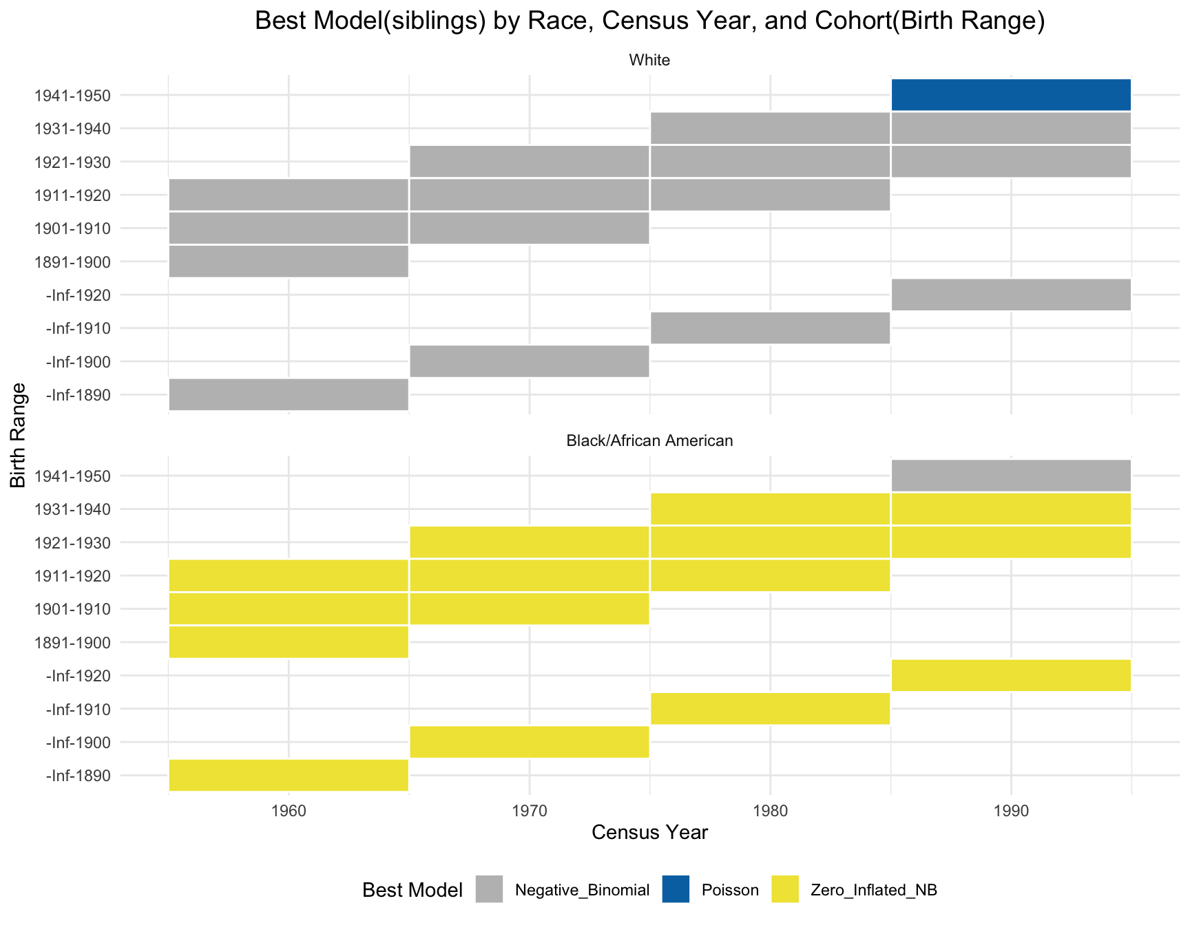
Same as the children’s part, we use visualization instead of statistical test here due to the due lack of data variability. The plot shows that the best model for each cohort(those with 1+ corresponding census year) is stable over time.
ggplot(best_models_sib, aes(x = Census_Year, y = Cohort, fill = Best_Model)) +
  geom_tile(color = "white", lwd = 0.5, linetype = 1) + # Create the tiles
  facet_wrap(~Race, nrow = 2) + # Facet by Race
  scale_fill_manual(values = c("Poisson" = "#0072B2", "Zero_Inflated_NB" = "#F0E442", "Negative_Binomial" = "grey")) +
  labs(
    title = "Best Model(siblings) by Race, Census Year, and Cohort(Birth Range)",
    x = "Census Year",
    y = "Birth Range",
    fill = "Best Model"
  ) +
  theme_minimal() +
  theme(
    plot.title = element_text(size = 14, hjust = 0.5),
    legend.position = "bottom"
  )
sessionInfo()R version 4.5.0 (2025-04-11)
Platform: aarch64-apple-darwin20
Running under: macOS Sequoia 15.5
Matrix products: default
BLAS: /Library/Frameworks/R.framework/Versions/4.5-arm64/Resources/lib/libRblas.0.dylib
LAPACK: /Library/Frameworks/R.framework/Versions/4.5-arm64/Resources/lib/libRlapack.dylib; LAPACK version 3.12.1
locale:
[1] en_US.UTF-8/en_US.UTF-8/en_US.UTF-8/C/en_US.UTF-8/en_US.UTF-8
time zone: America/Detroit
tzcode source: internal
attached base packages:
[1] stats graphics grDevices utils datasets methods base
other attached packages:
[1] ggpubr_0.6.0 rstatix_0.7.2 car_3.1-3 carData_3.0-5
[5] nnet_7.3-20 pscl_1.5.9 MASS_7.3-65 gridExtra_2.3
[9] ggnewscale_0.5.1 patchwork_1.3.0 rempsyc_0.1.9 scales_1.4.0
[13] knitr_1.50 viridis_0.6.5 viridisLite_0.4.2 lubridate_1.9.4
[17] forcats_1.0.0 stringr_1.5.1 purrr_1.0.4 readr_2.1.5
[21] tidyr_1.3.1 tibble_3.3.0 ggplot2_3.5.2 tidyverse_2.0.0
[25] dplyr_1.1.4 workflowr_1.7.1
loaded via a namespace (and not attached):
[1] gtable_0.3.6 xfun_0.52 bslib_0.9.0 processx_3.8.6
[5] callr_3.7.6 tzdb_0.5.0 vctrs_0.6.5 tools_4.5.0
[9] ps_1.9.1 generics_0.1.4 pkgconfig_2.0.3 RColorBrewer_1.1-3
[13] lifecycle_1.0.4 compiler_4.5.0 farver_2.1.2 git2r_0.36.2
[17] getPass_0.2-4 httpuv_1.6.16 htmltools_0.5.8.1 sass_0.4.10
[21] yaml_2.3.10 Formula_1.2-5 later_1.4.2 pillar_1.10.2
[25] jquerylib_0.1.4 whisker_0.4.1 cachem_1.1.0 abind_1.4-8
[29] tidyselect_1.2.1 digest_0.6.37 stringi_1.8.7 labeling_0.4.3
[33] rprojroot_2.0.4 fastmap_1.2.0 grid_4.5.0 cli_3.6.5
[37] magrittr_2.0.3 utf8_1.2.5 dichromat_2.0-0.1 broom_1.0.8
[41] withr_3.0.2 backports_1.5.0 promises_1.3.3 timechange_0.3.0
[45] rmarkdown_2.29 httr_1.4.7 ggsignif_0.6.4 hms_1.1.3
[49] evaluate_1.0.3 rlang_1.1.6 Rcpp_1.0.14 glue_1.8.0
[53] rstudioapi_0.17.1 jsonlite_2.0.0 R6_2.6.1 fs_1.6.6